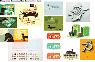
 The target audience of the Kangaroo Conservation Center (KCC) are families with children, so I want the look and feel to be colorful and playful. I want to utilize simple shapes and bright colors, which attract children... Some 3D aspect to represent the kangaroo (It's hop, tail, pouch, etc.)... Icons/information graphics for the Center's signage and map... And a distressed quality to represent the Australian outback and nature.
Buzzwords:
•Buoyant
•Exuberant
•Illuminating
•Environmental
•Lively
•Heartfelt

love the doggie stuff, it inspired me to make the book about my own doggie:)
ReplyDelete